
Apple’s in a Uptrend Channel, do we go higher?
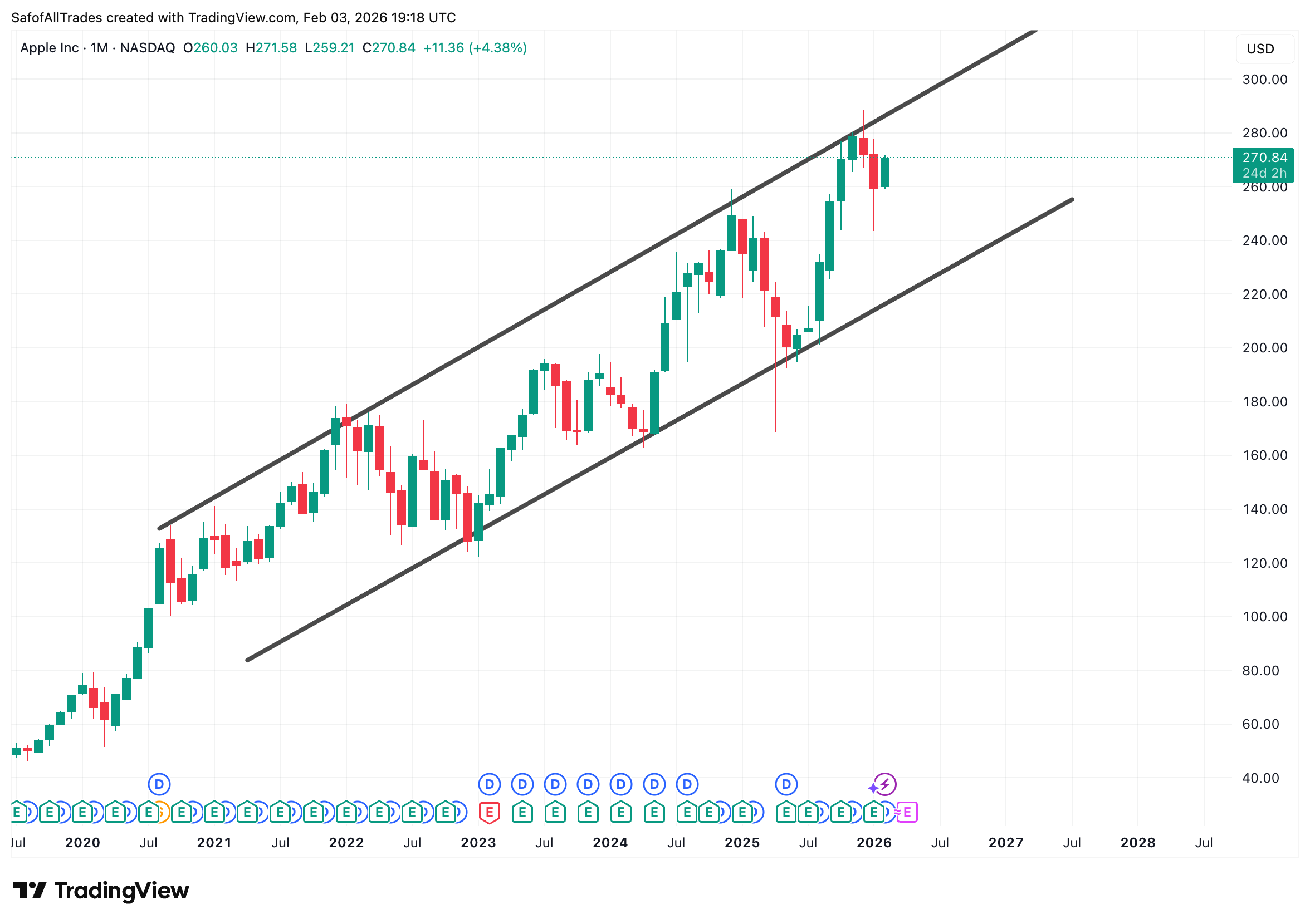
A chart of Apple’s Macro Trend Ascending Channel, highlighting channel bound price movement trend of 5 years.
Why Macro? Well, because we are using the 1 Month timeframe, meaning each candle is 1 Month of averaged price opens/closes.
We need to ask if we continue higher from here or could there be signs of possible price declines?
Being such a popular stock, lets humble ourselves together, remove the outside noise and look to the facts in the charts only, unbiasely to make informed decisions.
If we are indeed in a channel as mentioned above, using TA deduction skills we must look to how price action (candles) interact with the borders (trendlines) of said channel.
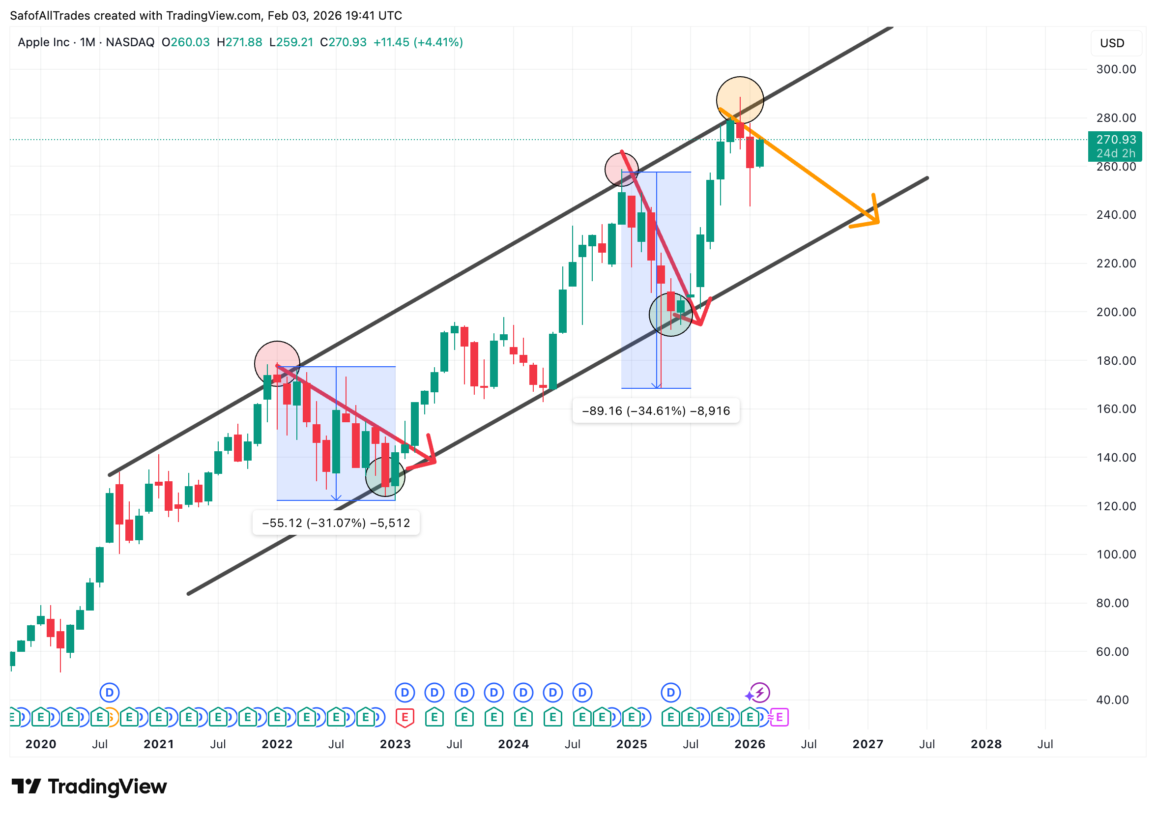
If we look back in history of the data presented, each time we have interacted with the Upper Border or Resistance trendline of channel, we have had price declines of 30% ish.
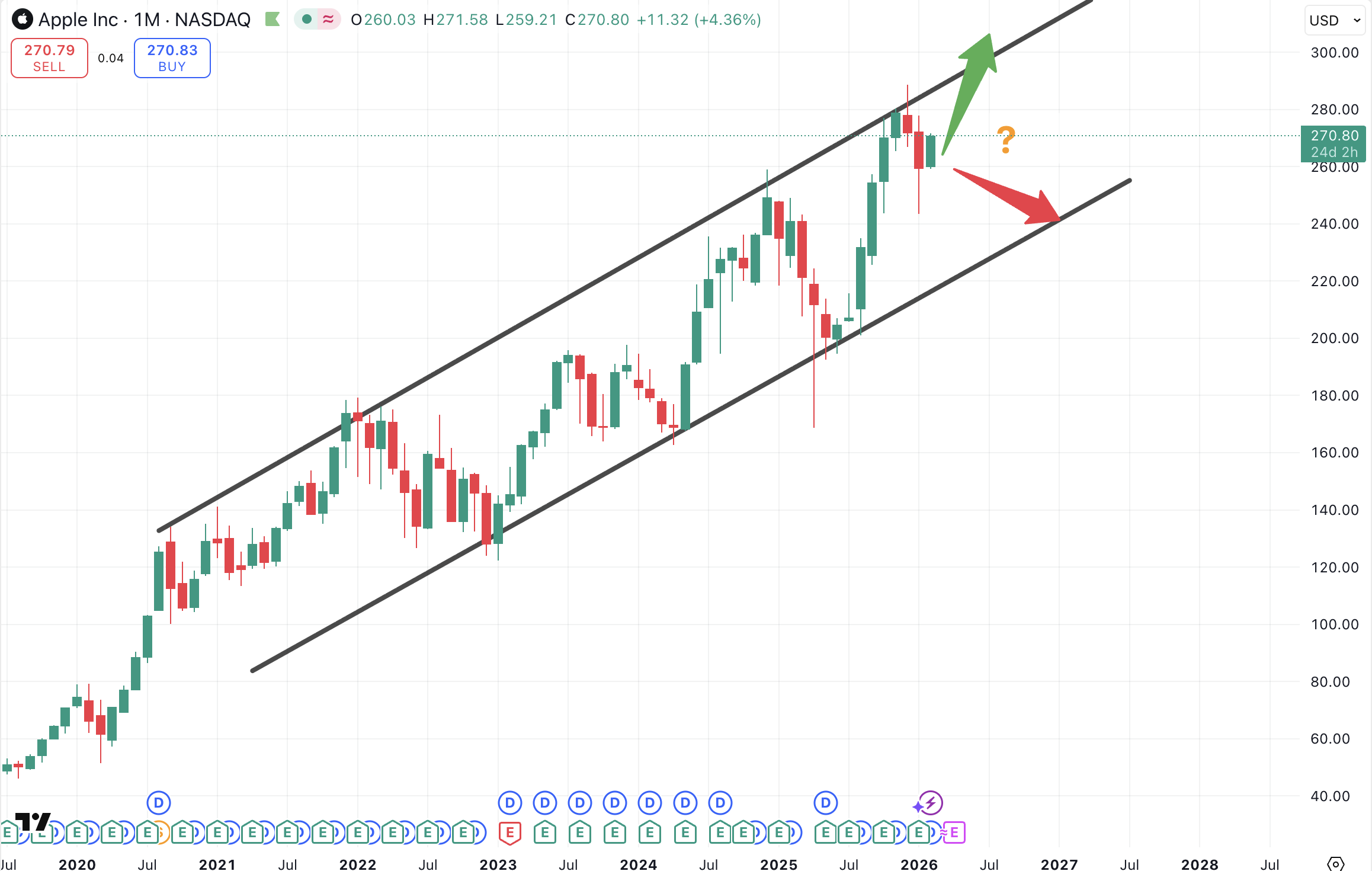
Something to consider, as we have in December 2025 have interacted with the upper border of the channel, depicted by Orange circle.
Will it be the same here? Or are we currently in a pullback and we will soon continue higher? Well since all things market associate with uncertainty, we really can’t be sure. But we can continue to look for evidence to see what the probabilities could be.
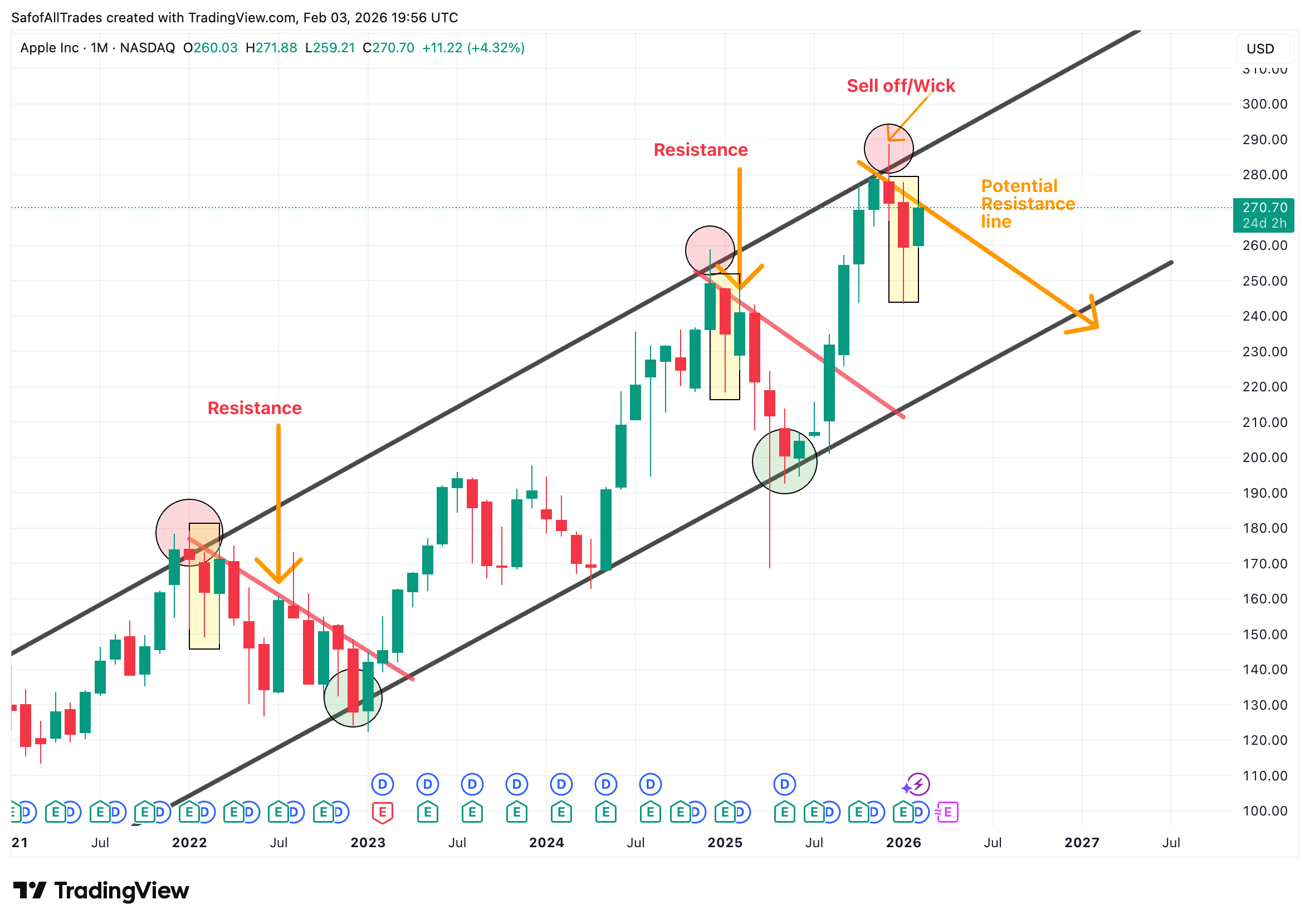
Looking for clues, we see that our December 2025 candle has an Upper Wick, which indicates that at some point in December it was a green candle, it attempted to breakout past the upper border but it then sold off quickly and closed lower.
This is a tell tale sign that supply exceeds demand or selling beat buying in this area and price is bound within the channel.
It will not be an easy feat to get past the upper bounds of the channel.
At the same time, a resistance trendline is now forming that is keeping price below a certain point, as seen by Orange arrow.
Previous 2 touch points has seen similar patterns and therefore have been highlighted.
Invalidation signs would be a breakout and confirmation above the Orange arrow line or resistance trendline.
Notice also the Yellow rectangle highlighting a candle with large lower wick. Usually lower wicks indicate buy pressure and could be signs of potential further upside. However in the case of APPLE, notice the previous historical data and the printing of such candle (which i remind you looks almost identical to previous interactions with upper border), it was followed by further sell off.
Indicators (Momentum)
We now look to indicators that can help us gauge at momentum in the stock, whether Bullish or Bearish.
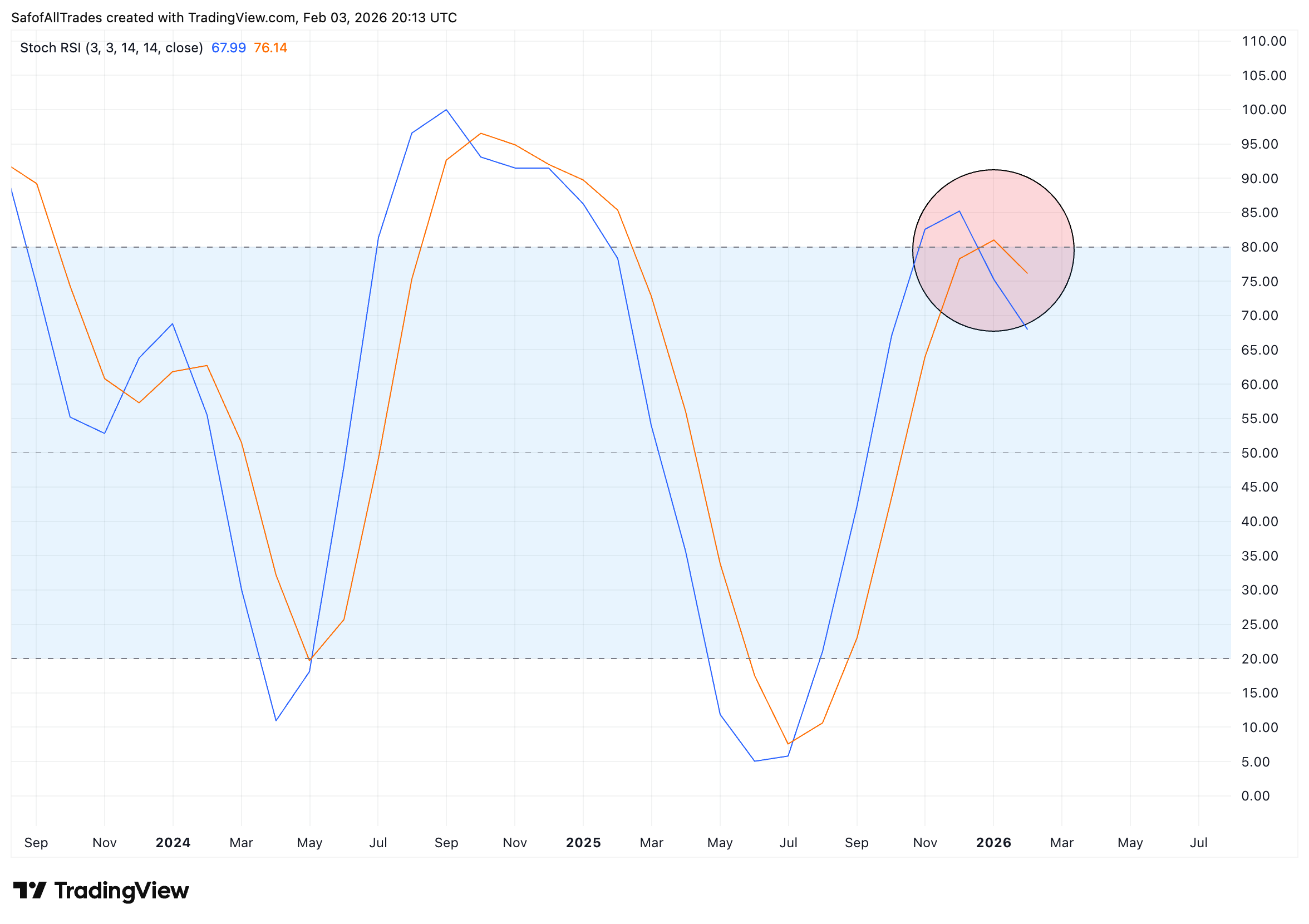
#1 - STOCH RSI
We have printed a Bearish Cross Below the 70 level.
On the 1 Month almost always leads to price DECLINES.
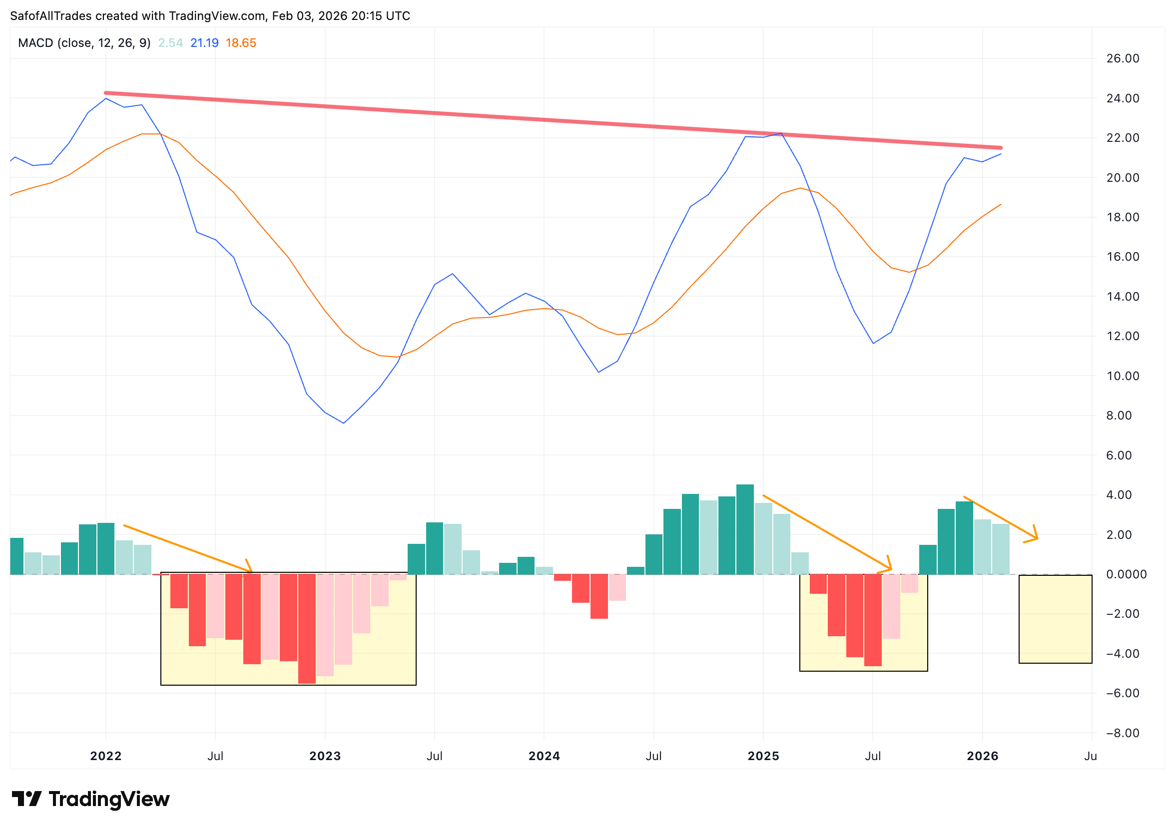
#2 - MACD
Bullish momentum is showing signs of waning.
Red line shows Lower High, indication of Bullish power decreasing.
Notice Histogram bar of current month are a pale green color and smaller. Looking back at previous data, it almost always lead to red bar prints and price DECLINES.
Heres the Momentum indicators in combination with price action and subsequent findings
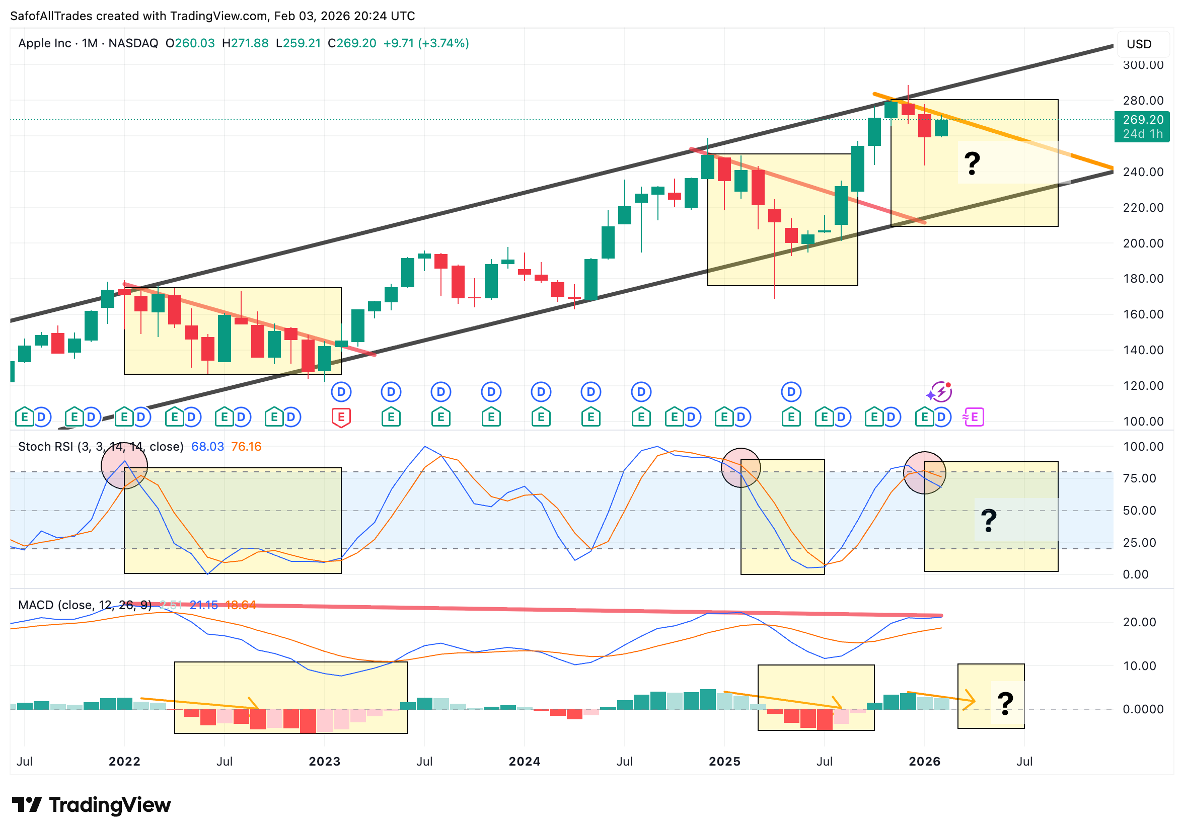
So we continue to look back into the historical data. And we can clearly see that when Bearish signals print in the Momentum Indicators (STOCH RSI, MACD), they coincided with being repelled by upper border of the channel, followed by Price DECLINES.
Probabilities support further declines as seen in previous data.
For the possibilities of the uptrend continuing we would need to see Bullish signals print in both MACD and STOCH RSI.
For MACD, we would need to see a darker green colored histogram bar print with Blue and Orange line mouth widing.
For STOCH RSI we would need to see a Bullish Cross where Blue line overlaps Orange line.
RSI Indicator
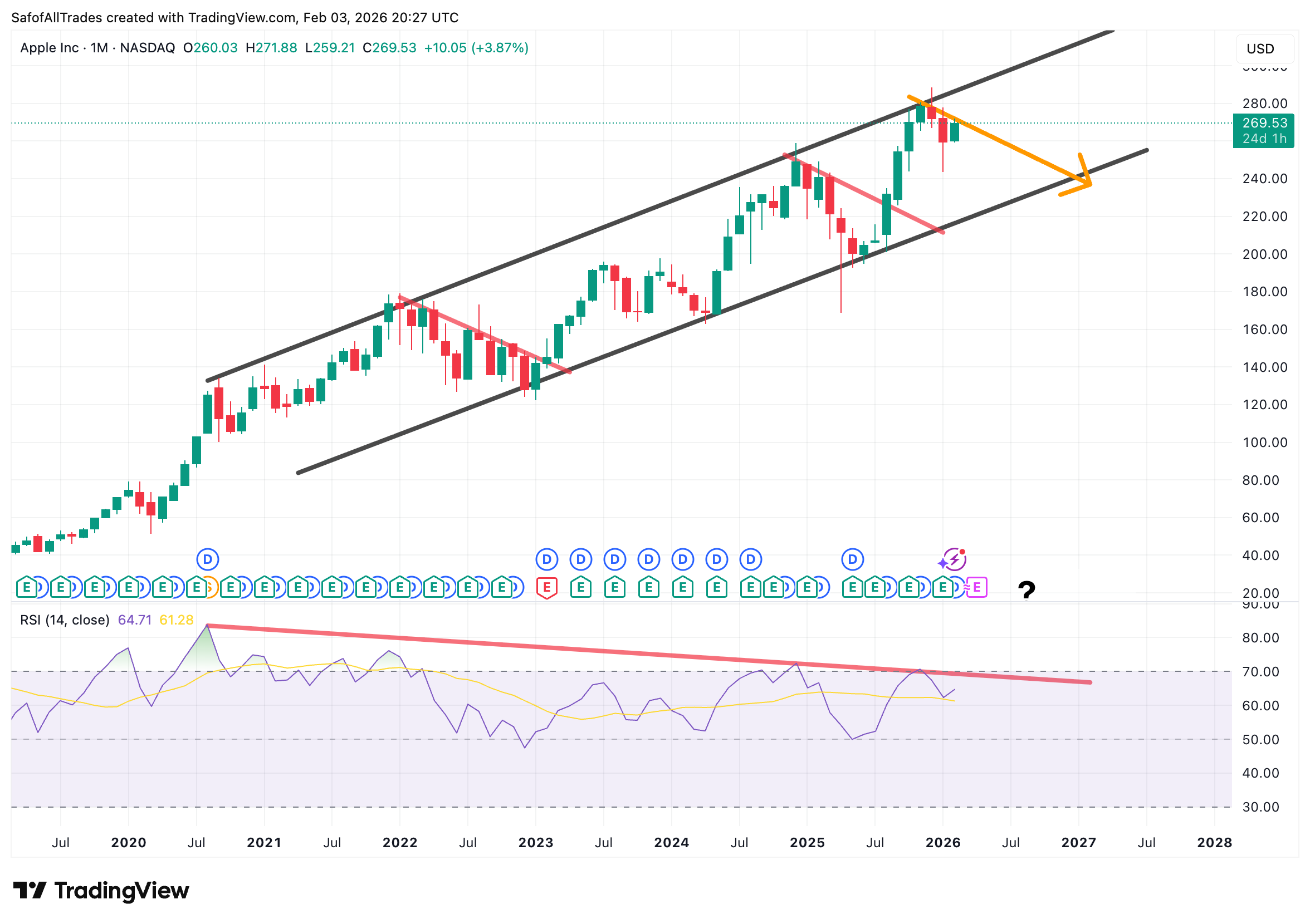
RSI is showcasing a Divergence.
Where RSI prints Lower Highs, seen by the down sloping red line. While, price prints HIgher highs as seen by channel.
In normal circumstances Price follows the same pattern as RSI. If RSI goes up price goes up, and if RSI goes down price goes down.
Divergence is often times utilized to indicate Price exhaustion, as it is linked to Price reversals so that Price reflects the indicator showing the divergence.
Only way to invalidate is for RSI to print a HIgher high above the red trendline and overtake previous RSI level print.